Friday, October 31, 2008

THE WOODEN HORSE

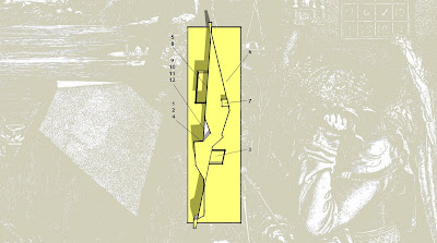
> The ideas for Dürer’s house are a continuation of the conceptual ideas from Equus merged with the focus on interiority from Mystery Play. The metaphor, representing Dürer’s fading mental health with a draping cloth, is reintroduced. Dürer is caught up within a fold in the fabric, the cloth constricting and encasing his existence. The built form is a materialisation of this metaphor, with the occupant, Dürer, within one these folds.
> The residence sits within a hill which covers the entire site, hiding the contours of the building’s envelope. This approach to the surrounding urbanity seemed fit for the statement being made about Dürer. The four light wells permeating from underneath the earth like periscopes provide a way of looking in from the outside, reinforcing the strong threshold between Dürer and the rest of the community. He is oblivious to his mental deterioration.
> The entire residence is underground, bearing the consequence that all of the spaces within it are introverted. The bedroom, bathroom, kitchen, dining, living and laundry spaces surround the central atrium which acts as the vertical axis for the house. This central area is occupied by the study, it being the space where Dürer spends most of his time. This of course is a response to his obsessive quest to find the ever-present formula for beauty. Within the atrium Dürer’s large collection of books extends up the height of the void; books being a symbol and a constant reminder of his everlasting fixation with his research.


Thursday, September 25, 2008

Tuesday, September 2, 2008

Food for thought

> 'Broadacre City' (1932-1958) by Frank Lloyd Wright was the antithesis of the city. It's 'organic' and decentralised organisation meant that it formed a continious sprawling landscape rather than the monumental, highly densified, rationally distributed 'Ville Contemporaine' (Le Corbusier).

> Yet a grid of any sort flies into the face of that idea. A grid in plan reminds us of a city because the idea of a modern city is a city built using a grid.

> Grids mean things are easily and equally devidable, buildable, leasable, stackable, shiftable, multiplyable and so on.

> A grid suggests repetition, a pattern. The city grid is something that is mirrored in less dense areas as well. Sprawling suburbs which follow the same typology establish a pattern, creating a grid.

> Patterns are found in nature yet from what I've seen they rarely take the shape of a grid.

> Grids also suggest division rather then inclusion. Grids are used to divide and sort things into their different types, uses, forms, colours or flavours.

> Grids are evil...

Tuesday, August 19, 2008

EQUUS

ONE was a direct response to the metaphor about obsession I picked up from Dürer's studies of drapery. The concept came about as I thought about the space between the folds and developed it into an architectural form. The idea of containment and enclosure begins to take shape as well through the large glazing akin to that of a fishtank, for example. The 'tower' is projected externally behind thick glazing, a play on the seemingly unreachable with which my character is so obsessed with. In addition to reflecting what's in front, a mirror also hides what's behind it, hence the connection with the unreachable.


TWO came about as a reaction to the constant pulling and pushing of shapes in Google Sketch Up. Picking up from where I left off in ONE I extruded the fold to give me an overall shape into which I would then fit the units (program). Transparent extrusions from the main body of the house were inspired by the analysis of images for geometric and mathematical relationships in proportion found in Dürer's artwork. In addition they reintroduced the concept of a fishtank as a form of enclosure and the building acting as shelter like a rock on a pond.
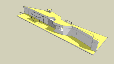
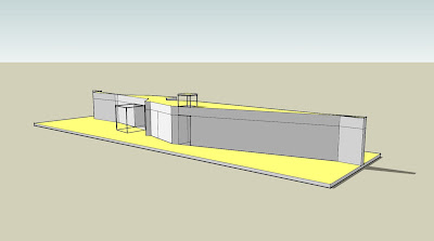

THREE is an extension of ONE, where the building is no longer half covered but is essentially shaped out of the ground. Organisational strategies are defined by the cradling or containing of units within the space enclosed by the mass around it. This design also returns to the idea of being covered by the fabric, wrapped up and constricted in one of its folds.
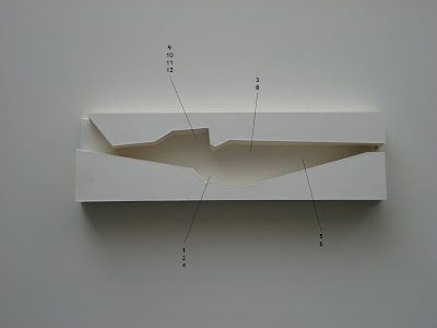


FOUR is an extension of the ideas behind TWO and THREE. Inverting the shape from THREE and turning it onto its side, it covers the house as it folds over the top. The enclosed space is home to all of the units at once, much like a fishtank, cage or prison cell. The concept describes Dürer's obsession in a very unambigious way; it is literally restricting th e occupier's everyday activites to the space left underneath the fold. The idea of the 'tower' is brought back into picture in a far less clear way. Skewing the notion of a 'tower' as a monument, I see the entire structure as a monument to who Dürer is. It truly reflects his personal self at the same time as well as keeping his eyes away from the truth on the other side.

Monday, August 18, 2008

Sunday, August 17, 2008

Dürer II


Dressed in his bathrobe Dürer ambles through his living room. Oscar his cat is startled by his sudden arrival from behind a large stack of books. He jolts up and over the cushion covered couch on which he was sleeping. Dürer rubs his temples. Had he missed something? Rummaging through his pockets his fingers brush past half a dozen post-it notes, bread crumbs, blunt pencils, his reading glasses and a screwed up lolly wrapper. He pauses; gently he pulls the wrapper out. This could be important. It sits in his hand, like a ladybug, immobile. Dürer puts on his glasses. He tries to peer inside the wrapper without unfolding it.

Nothing.

He unfolds the wrapper until every corner and every crinkle is as flat as it can possibly get after having sat in his robe pocket for God knows how long. Nothing.

He turns the tiny piece of plastic. Still nothing.

Disappointed, Dürer throws it into the nearest bin. The rug underneath his bare feet trembles for a couple of seconds as the 6:42 howls past 3 storeys below. He cleans the lenses of his reading glasses with his sleeve and puts them next to him on the coffee table. He leans back into a sea of cushions knocking off six or seven issues of Philosopher’s Digest as he kicks up his feet. He’ll have a sleep over it and maybe something will come to him later, he thinks. As the sun’s rays creep down the walls he falls asleep.

A blistering salvo from the doorbell abruptly stops his snooze. He pulls the woollen blanket over his ears in an attempt to ignore the unwelcome visit. Another salvo followed by resolute thumps on the door force him up of the couch. His mouth shouts “Yes!” whilst his hands try to shovel most of the mess out of the front door’s view before he opens it. Just as he moves his head past the safety of his door a thick envelop shoots through the two inch wide opening in the doorway. “Mail! Yours. Some idiot threw it into my mailbox!” Mrs Kornfelder snarls. Without waiting for a response she’s back across the hall and her door is slammed shut. “How kind”, Dürer mumbles with a distinct sarcasm in his voice “good day to you, too.”

At his desk Dürer stares at the self-addressed envelope for a long time before he finally pulls himself together and opens it. He rips open the padded envelope and retrieves what’s inside. It was another book to add to his collection. He had only ordered it last week. After reading texts on his namesake Albrecht he was fascinated by the depth of the symbolism and iconography in Renaissance painting. He started to dig a little deeper. Now his flat is filled with the stuff. He uncovered mysterious equations and hidden geometry everywhere he went. Consumed by the idea of an ever-present, all-governing law Dürer started to pursue it and found flaws in every attempt made before him. Convinced there was some sort of equation or formula which could be applied to absolutely everything he set out to capture the supreme law of beauty and proportion.

Dressed in his bathrobe Dürer sits under the dim light of his desk lamp, reading what he had received in the mail this afternoon. The floorboards underneath his slippers tremble for a couple of seconds as the 3:14 howls past 3 storeys below. Dürer pauses, laying the book face down on the desk. He takes off his reading glasses and rubs his temples. Had he missed something? Rummaging through his pockets his fingers brush past a couple of post-it notes, a half-eaten biscuit and an empty fountain pen.

The bin!

He’s on his feet, striding through the living room past the couch. Oscar his cat is startled by his sudden arrival. The bin. He reaches inside, digging for the piece of plastic. He pulls out a flattened lolly wrapper. Dürer puts his glasses back on. This could be important. He twists and turns the tiny piece of plastic, looking. Nothing.

Both sides. Nothing.


After one last glance he scrunches it up and puts it into his pocket. Still nothing.


Eye candy

from the album cover for 'Houses' by Skye Harbour

Saturday, August 16, 2008

Eye candy

jd architects

Friday, August 15, 2008

Yo!

After reading what Hejduk had to say about my character I dug a little deeper into the topic of Albrecht Dürer. The path I started to go down on in terms of research was the right one after all. After sifting through some incredibly dry historical stuff on Dürer I've found a couple of interesting things that I'd like to pick up on in the development of my character and his house(s):

> Dürer, like most Renaissance painters was obsessed with the mathematical rules of proportion and beauty. He even wrote 8 books about it; 4 about measurement and another 4 on human proportion.

> His artwork is laden with Christian and Renaissance symbolism and iconography. Yet three works stand out. They are St. Jerome in His Study, The Knight, Death and the Devil, and most famously Melancolia I. Wikipedia tells me art historians often refer to them as Dürer's Meisterstiche, "masterworks".

> In fact, it is said that his self-portrait, probably his most famous work, is an ellaborate exercise on how to paint a beautiful person using the Renaissance rules on beauty and proportion, rather than depicting Albrecht Dürer.

> I find the idea of a supreme ever-present all-governing rule intriguing and I can see how one could obsess about such a topic for a lifetime. People have and still do. It was proportion in the Renaissance, a modern example is the '23 Enigma'.

> I would like to explore this further by tweaking my character a little. I have hinted already that my character has some sort of obsession, but an updated version will follow soon... ish.

> I have also taken cues from Dürer's studies of drapery, one in particular which I have already posted earlier. I have this idea that an obsessive investigation about anything can be metaphorically represented by this cloth, cloaking the everyday life that's beneath, smothering it.

> The folds and creases can be seen as a metaphor for the constant cross-relating and doubling-back of thought that goes on when someone is seriously obsessed with something. For the person everything seems to revolve around and relate back to the obsessed about topic, but in fact I see it more as an additional layer. Like a draped cloth with folds and the spaces between.

> And so somehow I have ended up learning about mathematics from Donald Duck. I think I have lots of things to work with and go off on tangents from. I'm feeling like maths, algorithms, codes, iconography and symbolism are things that can very easily be related to an architectural idea and serve as a stimulus for it.

Over and out!

Thursday, August 7, 2008

Some of Albrecht Dürer's work

The Knight, Death and The Devil (1513-1514)
St. Jerome In His Study (1514)
Melencolia I (1514)

Study Of Drapery (1521)